Color is one of the most powerful tools in a web designer's arsenal. The right color choices can evoke emotions, guide user attention, and create memorable brand experiences. Whether you're designing a website for a Vienna-based startup or an international corporation, understanding color theory is essential.
The Color Wheel Explained
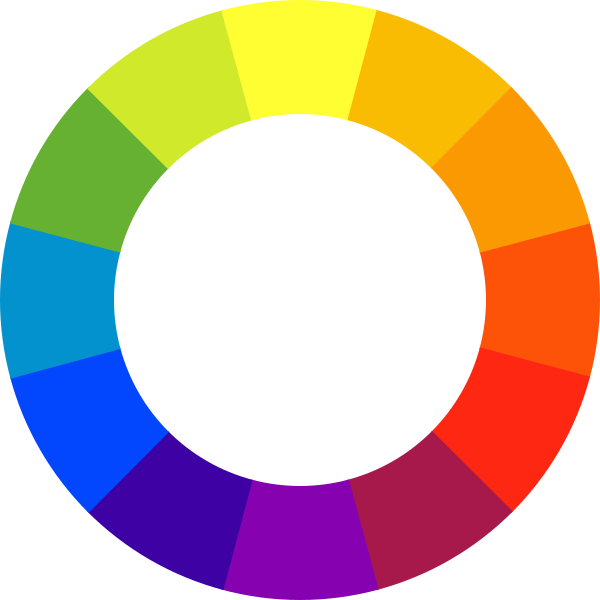
The color wheel, developed by Sir Isaac Newton in 1666, remains the foundation of color theory. It organizes colors in a way that shows their relationships and helps designers create harmonious combinations.
Primary Colors
In traditional color theory, the primary colors are red, yellow, and blue. These colors cannot be created by mixing other colors together. In digital design, we work with RGB (Red, Green, Blue) primaries, which combine to create light on screens.
Secondary Colors
Secondary colors are created by mixing two primary colors:
- Red + Yellow = Orange
- Yellow + Blue = Green
- Blue + Red = Purple
Tertiary Colors
Tertiary colors result from mixing a primary color with an adjacent secondary color, creating colors like red-orange, yellow-green, and blue-violet.
Color Harmonies in Web Design
Color harmonies are combinations of colors that work well together. Understanding these relationships helps create visually appealing and cohesive designs.
Complementary Colors
Colors opposite each other on the wheel (e.g., blue and orange). They create high contrast and visual impact, perfect for call-to-action buttons and important elements.
Analogous Colors
Colors adjacent to each other on the wheel (e.g., blue, blue-green, green). They create serene, comfortable designs and are often found in nature.
Triadic Colors
Three colors equally spaced on the wheel. This scheme offers strong visual contrast while maintaining color harmony and richness.
Color Psychology for Websites
Different colors evoke different psychological responses. Understanding these associations helps you choose colors that align with your website's purpose and target audience.
Blue
Trust, professionalism, calmness. Commonly used by financial institutions and tech companies.
Green
Growth, nature, health. Popular for eco-friendly brands and wellness websites.
Red
Energy, urgency, passion. Effective for sales, warnings, and creating excitement.
Yellow
Optimism, creativity, warmth. Great for attention-grabbing elements and youthful brands.
Practical Tips for Web Color Selection
Here are actionable guidelines for choosing and implementing colors in your web projects:
Start with a Primary Color
Choose one dominant color that represents your brand or message. This will be your primary color and should appear most frequently.
Apply the 60-30-10 Rule
Use your primary color for 60% of the design, a secondary color for 30%, and an accent color for the remaining 10%. This creates visual balance.
Consider Accessibility
Ensure sufficient contrast between text and background colors. The WCAG guidelines recommend a minimum contrast ratio of 4.5:1 for normal text.
Test on Multiple Devices
Colors can appear differently on various screens. Always test your color choices across different monitors and devices.
Recommended Color Tools
These free tools can help you create and refine color palettes for your web projects:
- Coolors - Fast color scheme generator
- Adobe Color - Professional color wheel and palette creator
- WebAIM Contrast Checker - Accessibility testing tool
- Color Hunt - Curated color palette inspiration
Conclusion
Mastering color theory takes practice, but understanding these fundamentals gives you a solid foundation for making informed design decisions. Remember that effective color use goes beyond aesthetics - it influences how users perceive and interact with your website. Start experimenting with different color combinations, and don't be afraid to iterate based on user feedback.